Heatmaps
Understand how Heatmaps show clicks, frustration, and scroll depth on tracked storefront pages.
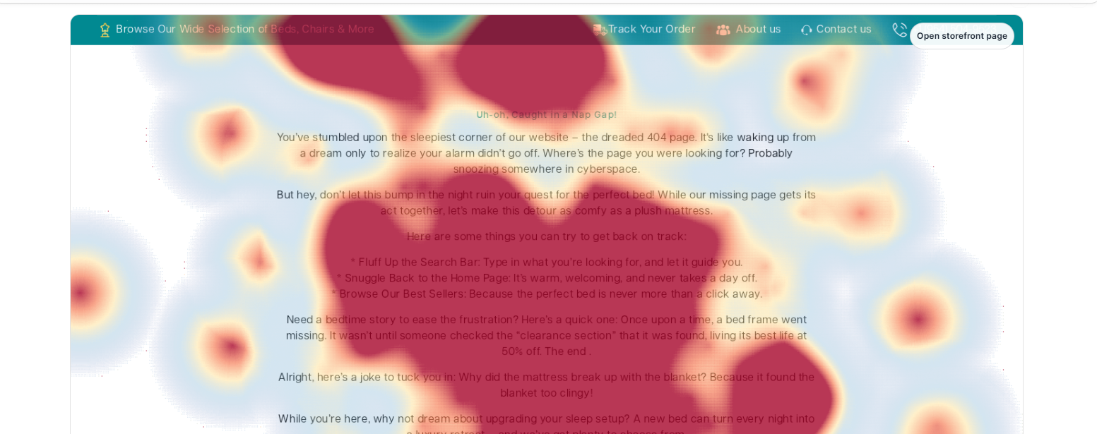
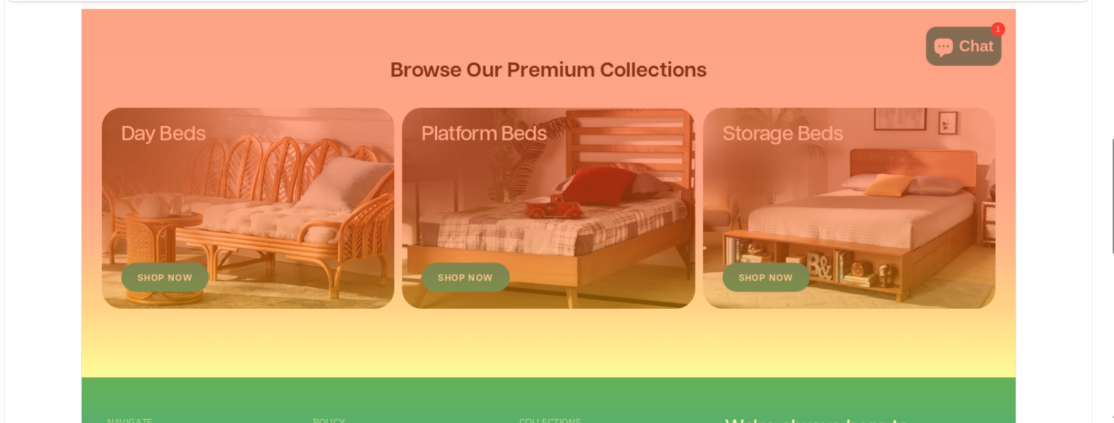
Heatmaps help users understand how visitors actually behave on a specific storefront page — where they click, where they get stuck, and how far down they scroll.
Instead of just showing totals, this page paints interaction data directly on top of a page screenshot so users can see attention, ignored areas, and friction at a glance.
What It Does
Users pick a tracked page, then narrow the data with filters: time range (Yesterday, Last 7 Days, Last 30 Days, Last 90 Days, or a Custom Range), device (Desktop / Tablet / Mobile), country, and event type (all interactions, normal clicks, rage clicks, dead clicks, error clicks, mouse-shake, or all frustration signals together).
The view toggle switches the heatmap between two layers:
- Clicks — where visitors are tapping, with hot zones colored by intensity.
- Scroll — how far down the page visitors actually reach, drawn as horizontal depth bands.
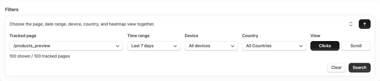
When the page has fewer than 20 interactions in the current filter, the canvas is suppressed with a "Not enough samples for a reliable heatmap" notice — small samples can look like hot zones even when they aren't. Between 20 and 100 interactions, a "Low traffic" warning pill appears so users know the picture is directional, not statistical.
For mobile, Heatmaps automatically uses portrait-orientation events to match the captured 375×812 mobile screenshot, so clicks recorded in landscape don't get plotted at the wrong horizontal position. Users can override this by switching the orientation filter explicitly.
Below the overlay, the page surfaces the most-clicked selectors on that page, page-level engagement gauges, an event-type breakdown, and optional advanced diagnostics for click activity and scroll sessions. Clicking any row in the Top Selectors list opens an Element Detail panel pinned over that element on the screenshot, with click counts, frustration counts, sessions, and above-the-fold context.
How To Use It Best
Start with a page that matters — a product page, top collection, landing page, or the homepage.
- Look at the heatmap overlay first. It tells you where attention is concentrated.
- Switch between Clicks and Scroll to compare where people interact with how far they actually reach. Bright clicks below a low scroll depth mean visitors are missing your most valuable content.
- To investigate friction specifically, keep the view on Clicks and change the Events filter to "Rage clicks", "Dead clicks", or "All frustration". The same overlay now shows where people are struggling instead of just clicking.
- Open Top Selectors to see which elements collect the most clicks or the most friction. Clicking a row pins the Element Detail panel directly on the screenshot, so you can see the element in context without leaving the page.
- If something looks off, expand Analytics Details and Raw Diagnostics for device patterns, event mix, and recent click and scroll sessions.
Analytics Details
This expandable section sits below the heatmap and gives users a deeper view of how the selected page is performing.
It helps them judge whether the data is statistically meaningful, where engagement breaks down, and which behavior signals deserve attention.
Row 1: Tracking Coverage
Shows how much usable tracking data exists for the current page and filters — total sessions, total interactions, and freshness of the most recent activity. Useful for sanity-checking that you're looking at a real signal rather than a thin sample.
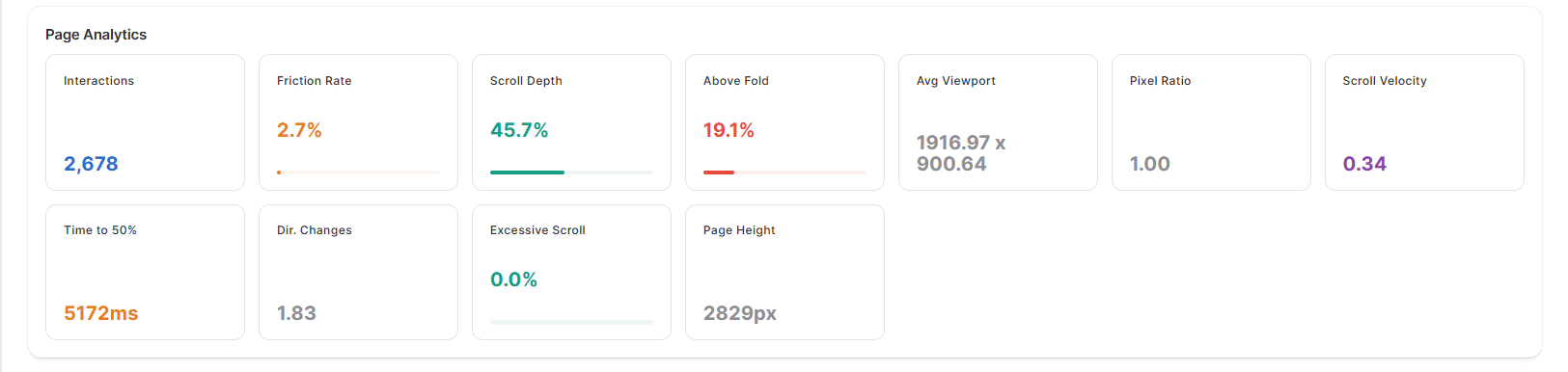
Row 2: Page Analytics
Engagement gauges summarize how visitors are interacting with the page:
- Scroll Depth — average percentage of the page reached.
- Above Fold — share of interactions happening in the first viewport.
- Friction Rate — share of interactions that were rage / dead / error clicks (color-coded green / amber / red as it crosses thresholds).
Toggling Show advanced diagnostics reveals deeper page-behavior tiles, including Scroll Velocity (how fast users scroll on average) and Excessive Scroll (sessions where users scrolled abnormally fast or back-and-forth — a signal of confusion or searching for something).
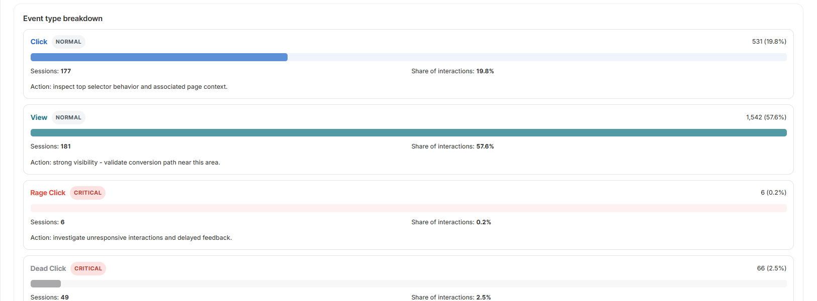
Row 3: Event Type Breakdown
Breaks activity down by event type — clicks, views, rage clicks, dead clicks, error clicks, mouse-shake, swipes, double-taps, long-presses — and shows the top selector that drives each. The collapsed view shows the most common event types; Show all expands the full list so users can audit even rare gestures.
It helps users quickly tell whether a page is showing healthy engagement or signs of confusion.
Raw Diagnostics
This is the troubleshooting layer of the Heatmaps page, intended for users who want to inspect recent interaction data row-by-row instead of relying only on summaries and overlays. Each table has its own device filter (All / Desktop / Tablet / Mobile) and sortable columns, so users can isolate exactly the slice they're investigating without changing the page-level filters above.
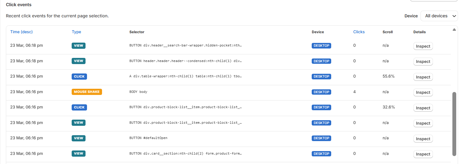
Row 1: Click Events
Shows recent click-level activity for the selected page — timestamp, event type, the clicked element, the device it happened on, scroll position, and an above-the-fold flag. Users can sort by time, type, or click count, and open a row to inspect element-level details.
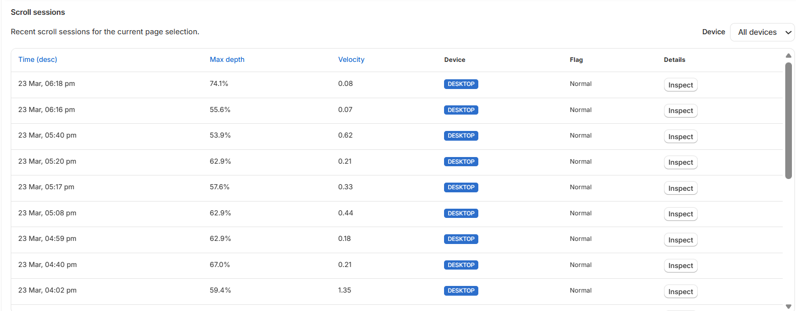
Row 2: Scroll Sessions
Shows recent scroll-session data — timestamp, max depth reached, scroll velocity, and device. It helps users understand how deeply visitors scroll, how quickly they move, and whether scrolling behavior looks normal or excessive.
Good Help-Guide Positioning
"Heatmaps show where visitors click, where they hit friction, and how far they scroll on each tracked page — so you can spot high-attention areas, confusing elements, and content that visitors aren't reaching."