SmartNudge
Understand how SmartNudge turns visitor behavior into targeted on-site interventions you can ship in minutes.
SmartNudge is where DynoWeb moves from observing visitor behavior to acting on it. You build behavior-triggered messages that appear on your storefront when a visitor matches a specific pattern — without touching the live theme and without writing code. DynoWeb watches the signals and proposes the message; you decide what gets created, what it says, what it looks like, and when it goes live.
What It Does
SmartNudge has two connected parts.
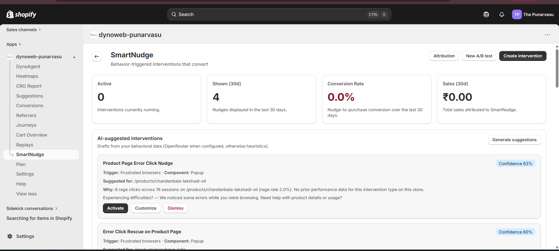
The intervention list shows every nudge you've created, its current status (active, paused, or draft), and performance data: how many times it was shown, clicked, and dismissed. AI-suggested nudges also appear here for you to review before activating — nothing fires on your storefront until you flip it to active.
The editor is a five-tab workspace that walks you through the brand fit, the layout, the copy, the visual design, and the behavioral trigger before you push the nudge live.
Once you activate an intervention, it fires on the storefront whenever a visitor matches the trigger conditions you set. You can pause, edit, or delete it from the dashboard at any time.
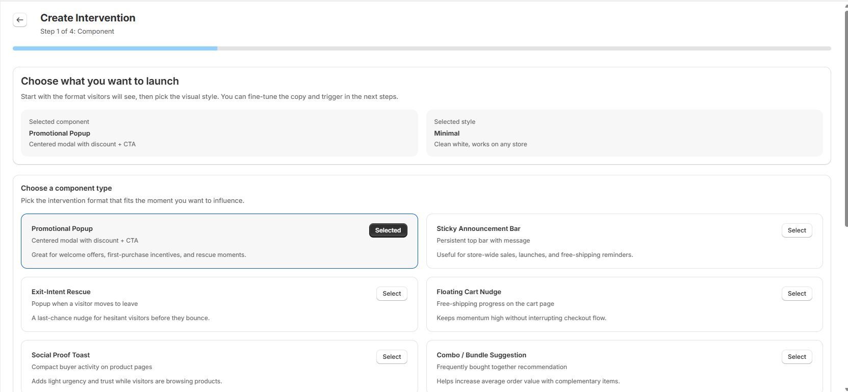
Components
Eleven component types are available, each suited to a different moment in the visitor journey:
- Promotional Popup — a centered modal with a headline, body copy, and CTA button. Best for discount offers and rescue moments.
- Sticky Announcement Bar — a persistent bar at the top of the page. Best for store-wide messages and free-shipping reminders.
- Exit-Intent Rescue — a popup triggered when a visitor's cursor moves toward the browser chrome. Best for last-chance retention.
- Floating Cart Nudge — a widget showing progress toward a free-shipping threshold on the cart page.
- Social Proof Toast — a compact notification showing recent buyer activity on product pages.
- Combo Bundle Suggestion — a frequently-bought-together recommendation shown on product pages.
- Countdown Timer — a sticky bar with a live countdown. Best for limited-time campaigns.
- Product Badge — a label injected directly onto product cards.
- Free Shipping Progress Bar — a bottom bar showing distance to the free-shipping threshold throughout the store.
- Fullscreen Takeover — an immersive landing-style overlay. Best for major launches or seasonal campaigns.
- Side Message — a slide-in panel anchored to the page edge. Best for context-sensitive offers without blocking the page.
The Five-Tab Editor
When you open or create a nudge, you land in a five-tab editor. The tabs are sequential but you can jump between them: Brand → Templates → Content → Design → Trigger. A live preview panel runs alongside every tab so you see the result in real time.
1. Brand
The Brand tab is where your nudges learn what your store looks and sounds like. You give SmartNudge a URL — your own store, a sister site, or a competitor whose look you want to match — and DynoWeb crawls a handful of representative pages (homepage, about, a collection, a product page, contact) and extracts a complete brand profile.
What gets captured:
- Visual identity — logo, favicon, full color palette (primary, secondary, accent, background, text, CTA), and detected theme (light or dark)
- Typography — headline and body fonts, matched to a list of 1,500+ Google Fonts so anything we propose actually loads on your storefront
- Personality — three or four brand traits (e.g. modern, playful, premium) and tone guidance
- Voice guide — sample phrases that match how your store talks, plus do/don't word lists
- Imagery style — visual keywords, mood, photography style
- Design tokens — colors, type scale, spacing, CTA shape, animation, layout — pre-resolved into the format the popup engine actually consumes
Extraction takes around 30 seconds. You'll see a six-step progress indicator: Fetching homepage → Discovering internal pages → Crawling pages → Extracting colors and fonts → Analyzing personality and voice → Generating tokens.
After extraction, every field is editable. Open a color in the palette editor and pick a different shade. Swap a personality trait. Edit the voice guide. Nothing is locked in.
You can save up to 20 brand profiles per store, so you can keep separate identities for different campaigns or sub-brands.
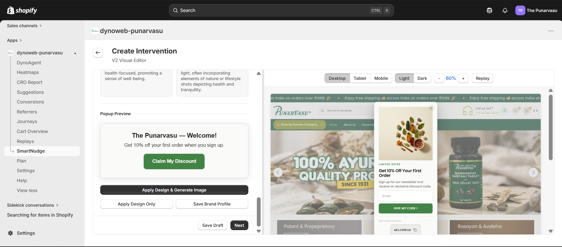
When you're happy, click Apply Design & Generate Image to push the brand into the current nudge. A six-variant rotation system ensures that two nudges built from the same brand profile won't look visually identical — colors, image placement, content alignment, and decorative styling rotate to keep things fresh.
2. Templates
The Templates tab opens a gallery of 30+ curated, ready-to-customize popup templates organized by goal: list building, cart recovery, upsell, seasonal campaigns, gamification, and more. One click drops a template into your nudge with copy, layout, and design tokens already filled in. Use it as a starting point and tune from there — or keep it as-is.
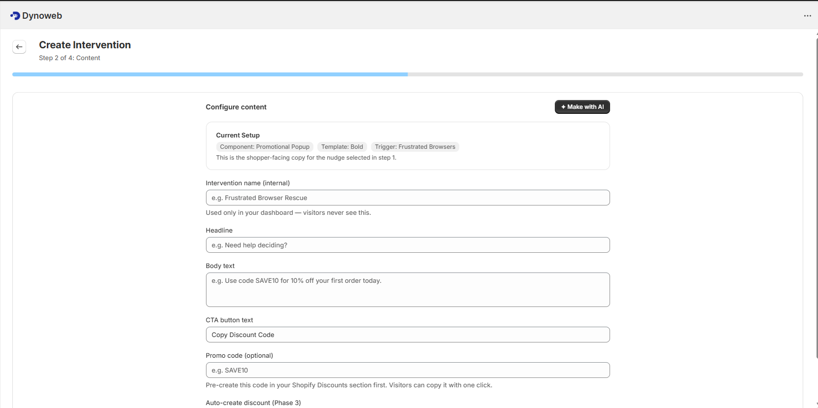
3. Content
The Content tab is where you write the message your visitors actually see.
- Intervention name — internal label only, never shown to visitors.
- Headline — the shopper-facing heading.
- Body text — one or two sentences with the core message or offer.
- CTA button text — the action label on the button.
- Promo code — optional. Pre-create the code in Shopify Discounts, then reference it here so visitors copy it with one click.
- Image — see below.
The Make with AI button at the top of the tab generates all the text fields for you in one pass, matched to the component, brand profile, and trigger you've selected. A frustrated browser gets a different message than a cart abandoner; a luxury brand gets a different tone than a streetwear brand. The output is a starting draft — you read it, edit anything that doesn't sound right, and decide what stays.
Image Picker (new)
Most components support an image (the two exceptions are Product Badge and Free Shipping Progress Bar, which are text-only by design). The image picker offers four sources:
- Upload — drag-and-drop or file picker. JPEG, PNG, WebP, or GIF up to 5MB. The file is stored in your Shopify Files library, so you own the asset on your own CDN.
- Shopify product catalog — browse your products by title, collection, or type and pick a variant image directly. The nudge references the product image already on your store, no copying needed.
- AI generation — give a prompt, pick a style preset (Product Showcase, Lifestyle, Abstract Pattern, Seasonal Festive, Minimalist, or Brand-Matching), and DynoWeb generates an image and saves it to your Shopify Files. Daily cap of 10 generated images per store.
- URL — paste any external image URL.
When you click Apply Design & Generate Image on the Brand tab, an AI image is generated in the background using your brand colors, imagery style, personality, and detected theme — and dropped into the picker for you. You can swap it out, tweak the placement, or generate again.
Placement options on the picker include Hero (full-width above the headline), Side-Left / Side-Right (50/50 split), Background (behind content with adjustable overlay opacity), Thumbnail (inline), or None. You can adjust fit (cover, contain, fill), opacity, border radius, and alt text.
4. Design
The Design tab gives you fine-grained control over how the nudge looks. If you applied a brand profile, every field here is pre-filled — you only touch what you want to override.
- Colors — 11 named tokens (background, text, headline, body, accent, CTA background, CTA text, border, etc.), each with its own color picker.
- Typography — font family dropdown drawn from the supported Google Fonts list, with size and weight sliders for headline and body separately.
- Spacing — padding, border radius, popup width, gap between elements.
- CTA button — shape selector (square, rounded, pill), padding, shadow, full-width toggle.
- Animation — entry animation dropdown with live preview and duration slider.
- Close button — X / text / icon, top-right or top-left.
- Layout — popup position on screen, content alignment.
A Preset themes menu offers 25 one-click looks (five core, ten color-based, ten seasonal) you can apply and then continue customizing.
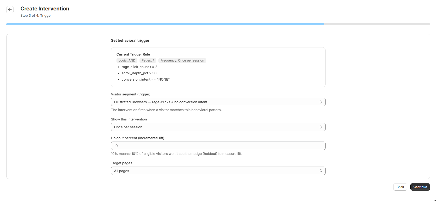
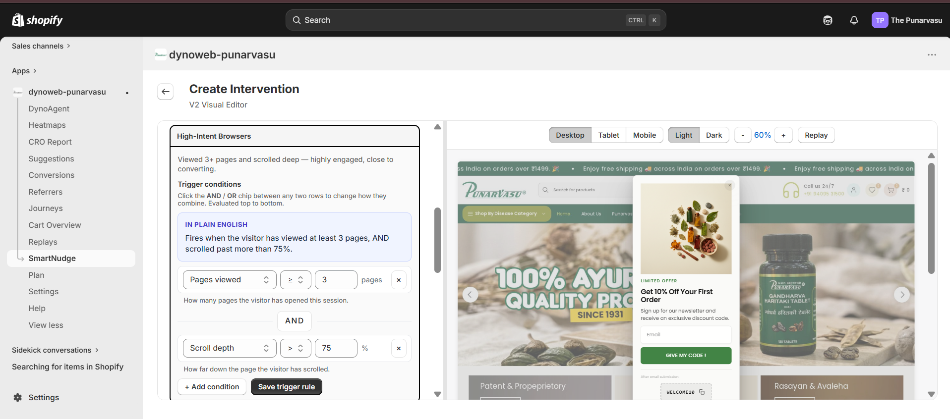
5. Trigger
The Trigger tab decides who sees the nudge and when. Pick a visitor segment — a behavioral pattern that has to match before the nudge fires — from options including:
- Frustrated Browsers — rage-clicks with no conversion intent
- Price Hesitators — 30+ seconds on a product page without adding to cart
- Cart Abandoners — added to cart, abandoned at checkout
- High-Intent Browsers — 3+ page views with deep scroll
- Exit Intent — cursor moving toward the browser chrome
- Scroll Passers — scrolled past 80% but never clicked
Frequency controls (once per session, once per day, once ever, or always) and target pages (all pages, product, collection, or cart only) finalize the targeting.
Live Preview
The preview panel runs alongside every tab. It shows your nudge rendered as it would appear on the storefront, updating in under 50ms after any field change.
- Viewport — toggle between desktop (1280px), tablet (768px), and mobile (375px) to confirm the layout holds at every size.
- Background — switch between light and dark to spot color contrast issues.
- Zoom — 50–200% slider for fine inspection.
- Animation replay — re-trigger the entry animation without rebuilding the nudge.
- Preview on my store — open a one-time preview link on your live storefront so you can see the nudge in its real context (without firing it for real visitors).
How To Use It Best
The best starting point is to pick one visitor segment that represents a known problem. If mobile bounce rates are high, start with Frustrated Browsers or Price Hesitators. If checkout abandonment is the issue, Cart Abandoners with an Exit-Intent Rescue or a Promotional Popup is the natural pair.
If this is your first nudge, start on the Brand tab — even if you're using a template — so the design and AI-generated copy actually match your store's look and voice. A 30-second extraction up front saves an hour of manual color tweaking later.
On Content, use Make with AI for the first draft, then read it carefully. The AI gives you a starting point; you decide whether the headline lands, whether the body is too pushy, whether the CTA matches your brand voice. Edit freely.
On Design, you usually don't need to touch most fields if you applied a brand profile. Spend your time on the close button (visitors who can't dismiss easily get frustrated) and the entry animation (a slow fade reads as premium, a sharp slide reads as urgent — pick what fits the moment).
On Review, confirm component, copy, trigger, and frequency match the scenario you intended. Save as a draft if you want to think about it; activate when you're sure.
After a nudge has been running for a few days, check the performance column. A high shown count with a low click count usually means the copy or CTA needs adjusting. A high dismiss count can mean the nudge is firing too early or too frequently — try tightening the trigger.
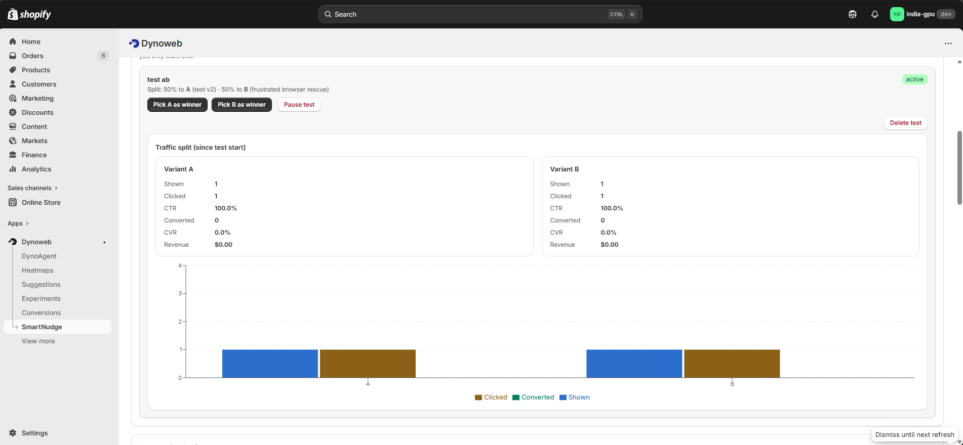
A/B Testing Nudges
Active interventions can be placed into an A/B test to compare two variants — different copy, different components, or different trigger timing — against each other. You set the traffic split, DynoWeb randomly assigns visitors to each variant, and conversion metrics are tracked separately per variant in the SmartNudge dashboard.
Use A/B tests to validate hypotheses, not to discover them: form a clear theory ("the discount needs to be visible in the headline, not the body"), build the two variants that test it, and let the data tell you which one wins.
Summary
SmartNudge turns the behavioral signals DynoWeb collects into real-time messages on your storefront. DynoWeb finds the moment, drafts the message, matches it to your brand, and renders the preview — you choose what gets built, what it says, and when it goes live. Every nudge stays under your control: pause, edit, A/B test, or delete from the dashboard at any time.