

Heatmaps
Click, frustration and scroll-depth overlays on screenshots of your real pages, with per-element counts behind every hotspot.
A heatmap answers the question a page-level metric cannot: which part of the page is the problem. Bounce rate tells you the page failed. A frustration heatmap tells you it failed at the size selector, 40% of the way down, on mobile only.
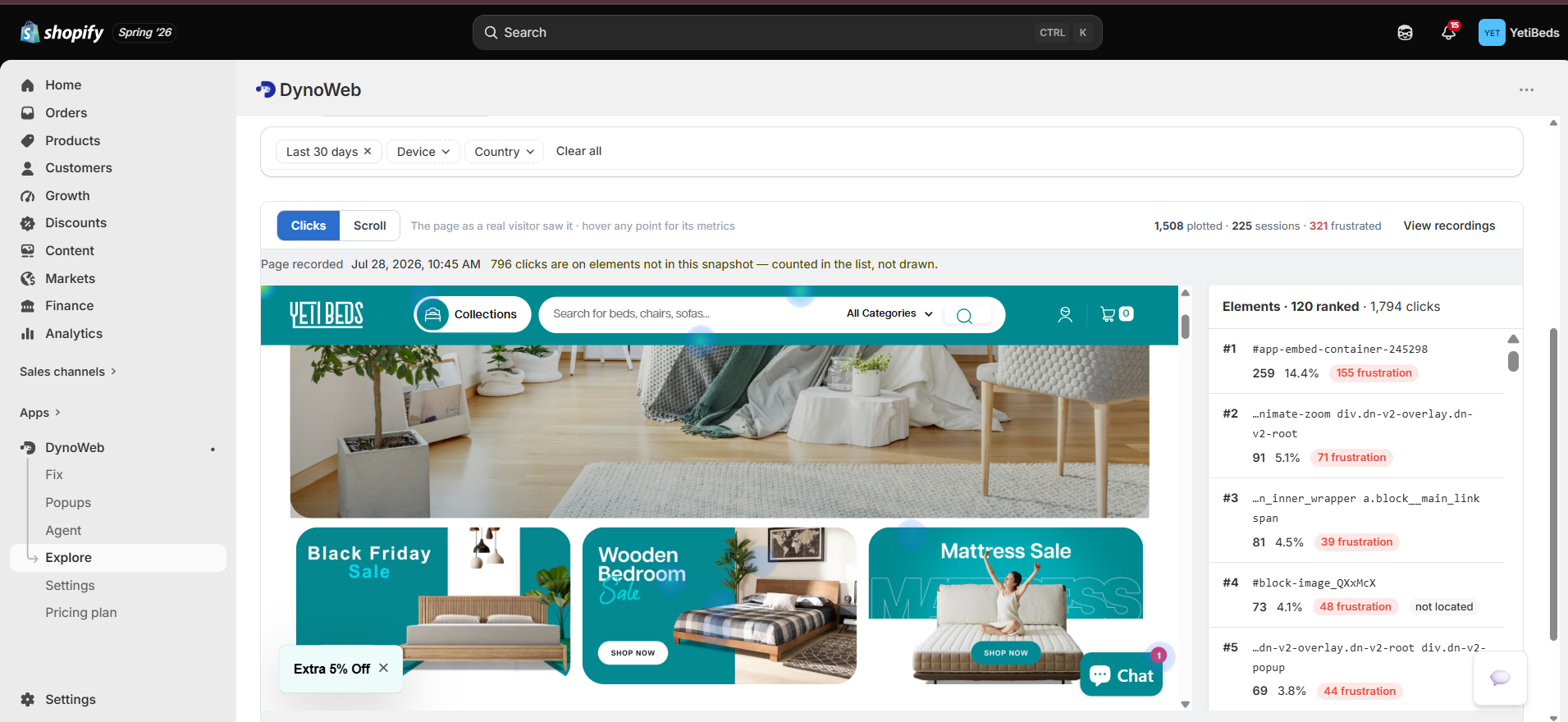
DynoWeb renders three overlays on a screenshot of the actual page, taken from your live storefront, and every coloured region is backed by a real per-element count you can open.
The three modes
Click
Intensity of clicks and taps. Hot regions are where attention converts into action. The failure this catches is a primary CTA sitting in a cold zone — the button is there, nobody presses it.
Frustration
Rage clicks, dead clicks and error clicks only. A hot region here is not engagement, it is a shopper hitting something that does not work. This is the mode that maps directly onto lost revenue.
Scroll depth
How far down the page visitors actually get, with 25% / 50% / 75% / 100% milestones. If 80% of visitors never reach the product description, they are deciding without it.
Frustration mode (rage-click data) is a Pro capability. Free and Growth get click and scroll. Custom adds the full mode set plus an event-type filter, so you can isolate a single signal — swipes only, or dead clicks only — instead of the blended frustration view.
What counts as frustration
These are the signals the frustration overlay is built from. They are captured by the tracker on every session, not sampled.
| Signal | What the tracker looks for | What it usually means |
|---|---|---|
| Rage click | Rapid repeated clicks on the same target | The element looks interactive and is not responding — or the page is too slow to acknowledge the press |
| Dead click | A click on an element with no handler and no navigation | Something looks clickable. Text styled like a link, a product image with no quick view |
| Error click | A click that threw a JavaScript error | Genuinely broken. Failed form submit, crashed add-to-cart, dead nav item. Blocks the sale outright |
| Mouse shake | Rapid cursor oscillation (desktop) | Confusion about where to go next, or a page that is not responding |
| Fat-finger tap | A tap that misses a small target (mobile) | Tap targets below the 44px minimum |
Mobile gestures — swipe left/right/up/down, pinch in/out, double tap, long press — are captured alongside these. They are diagnostic in their own right: repeated pinch-out on a product page means your text or spec table is too small to read, and repeated swipe on a static image block means shoppers expect a carousel that does not exist.
Element detail
Clicking any region on the overlay opens the element panel. This is the part that turns a picture into an argument you can act on.
- Click count and click rate — raw clicks, and clicks as a share of sessions that actually saw the element
- Rage, dead and error click counts for that element specifically
- Scroll depth at that position — how many visitors ever got far enough down to see it
- Desktop vs mobile split for the same element, which is where most surprises live
The desktop/mobile split matters more than it sounds. A CTA that performs fine overall and terribly on mobile reads as "fine" in every page-level metric, because desktop traffic carries the average. The element panel is where that comes apart.
Filters
The same filter set as the rest of the app, so a heatmap is directly comparable to the dashboard number that sent you here:
- Page — any tracked URL on your store
- Date range — today, yesterday, last 7, last 30, or custom
- Device — all, desktop, mobile, tablet
- Country / region
Filter first, then read the overlay. An unfiltered heatmap on a store with 70% mobile traffic is a mobile heatmap wearing a desktop screenshot.
Scroll depth card
Scroll mode has a dedicated summary alongside the overlay:
- Percentage of sessions reaching each of the four milestones
- Maximum depth reached
- Time to 50% — how long it takes a typical visitor to get halfway
Time-to-50% is the one people ignore and shouldn't. A page where visitors reach 50% in three seconds is being skimmed past; the same depth reached over forty seconds is being read.
Limits
- Heatmaps need traffic per page. A page with a handful of sessions produces a picture that looks confident and means nothing. Read the frustration overlay on your highest-traffic pages first.
- The overlay is drawn on a screenshot, so a theme change that moves elements makes older regions land in the wrong place until a fresh screenshot is captured. Compare like-for-like windows around a redesign, not across it.
- Blended device views mislead. See above — filter by device before drawing conclusions.
- Frustration is a symptom, not a diagnosis. A hot rage-click region tells you where to look, not what broke. That is what session replay is for.
Where it goes next
A heatmap hotspot is the start of a chain, not the end:
Session Replay
Watch the sessions that generated the hotspot and see what the shopper was actually trying to do.
AI Suggestions
Frustration clusters detected here become ranked, scored suggestions with a concrete fix attached.
Impact
After you fix it, the rage-click rate on that exact selector is the KPI Impact measures.
Still choosing a tool rather than reading your own data? We wrote up the heatmap apps that work on Shopify — ten of them, including the cases where one of the other nine is the better buy — and a matching round-up of Shopify session recording apps.
Common questions
Will heatmap tracking slow down my storefront?
The tracker is loaded asynchronously and deferred behind first paint, so it does not block rendering or interactivity. If you want to see the actual cost on your own theme, Storefront Speed reports the weight of every script on the page, including ours.
Do heatmaps work on password-protected or dev themes?
Yes. You can collect on an unpublished theme to validate a redesign before it goes live, then compare the new heatmap against the old template side by side.
How is this different from Hotjar or Microsoft Clarity?
Those tools render the heatmap and stop. DynoWeb knows what a variant selector, a cart drawer and a checkout step are, ties each zone to the Shopify products behind it, and finishes the sentence by proposing the fix and attributing the revenue change afterwards.
Can I heatmap a page that changes per visitor?
Yes. Dynamic sections, A/B variants and personalised blocks are captured against the DOM as the visitor actually saw it, so the overlay matches their page rather than a generic template snapshot.
How much traffic do heatmaps need?
Enough sessions on a single template that the pattern is not noise. A few dozen is not enough to act on, no matter how convincing the picture looks. Lower-traffic stores should give it several weeks before drawing conclusions.
Do heatmaps work on mobile?
Yes, and you should read mobile separately rather than blended with desktop. Tap behavior and scroll depth differ enough that an averaged map describes neither.
What happens when I change my theme?
Maps are built per template, so history is not thrown away by an unrelated edit. A structural rebuild of a section will naturally split before and after, which is what you want when comparing.
How DynoWeb works
DynoWeb is one loop — find the leak, decide the fix, apply it, prove what it moved. Twelve capabilities, each one a step of that loop.
Session Replay
Reconstructed visitor sessions with frustration markers on the timeline, so you can jump to the moment something went wrong instead of watching from the top.