

CRO Report
A full-store conversion audit that costs the leak from six pure-math formulas, ranks the fixes, and states its confidence — or refuses to give a number at all.
A CRO audit from an agency costs four figures and takes three weeks. What you get back is a document: the leak sized, the funnel broken down, the fixes ranked, and an argument for why that order is the right one.
The CRO Report is that document, generated from your own behavioural data. The thing that separates it from a scorecard is that it puts money on each problem — and shows the arithmetic, so you can disagree with a specific step rather than with the total.
The revenue leak, from six formulas
Six independent calculations run over your rollup data. Each returns a monthly range, not a point estimate, and each publishes its formula, its inputs, its assumptions and its confidence tier alongside the number.
| Formula | What it measures |
|---|---|
| Mobile conversion gap | What mobile would earn if it converted at your desktop rate |
| Scroll-depth loss | Revenue behind content most visitors never scroll far enough to see |
| Frustration loss | Sessions carrying rage, dead or error clicks that failed to convert |
| Cart-abandonment recovery | The recoverable slice of filled carts that expired |
| Dead-click loss | Value lost to elements that look interactive and are not |
| Traffic-source relevance gap | Channels landing traffic that converts far below your own baseline |
No model produces a dollar figure
Every monetary number in this report is arithmetic on data you own. The language model writes the narrative and the recommendations; it never estimates money. That split is deliberate — a plausible-sounding number with no derivation is the single easiest way for a tool like this to be confidently wrong.
Confidence, and the refusal to guess
Every figure carries one of four tiers, set by sessions, orders and days of data:
| Tier | Roughly | What you see |
|---|---|---|
| High | 500+ sessions, 20+ orders, 7+ days | Full figures with ranges |
| Medium | 100–500 sessions, 5–20 orders, 3–7 days | Figures with a stated caveat |
| Low | 30–100 sessions, 3–5 orders | Directional only |
| Insufficient | Under ~30 sessions or ~3 orders | No revenue number at all |
The bottom row is the one worth noticing. Below the floor the report does not produce a smaller, hedged estimate — it declines, and says why. A revenue figure extrapolated from nine orders is not a cautious number, it is a wrong one.
What the report contains
Executive summary and health grade
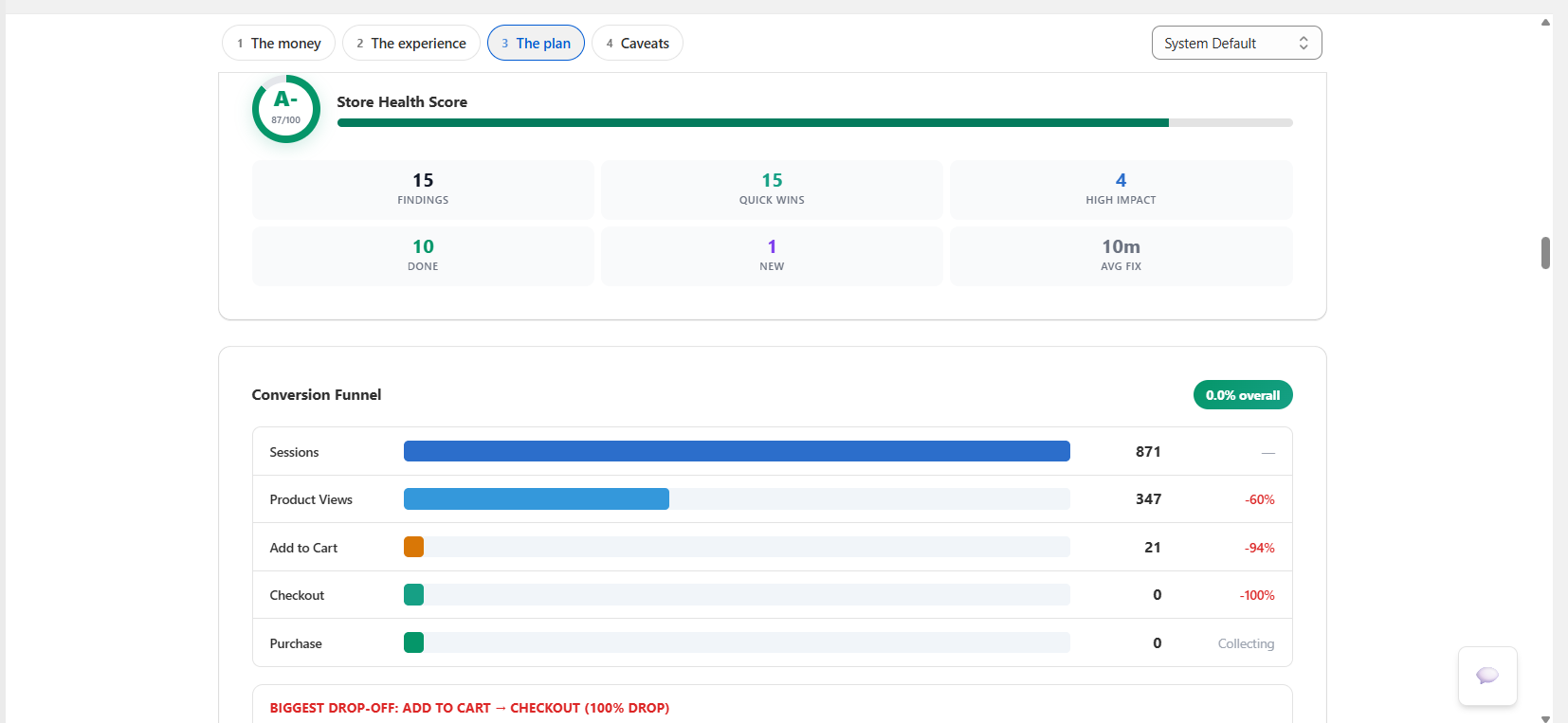
A plain-English brief plus an A–F store grade, so the first page is readable by someone who has never opened DynoWeb.
Funnel, with money at every stage
Sessions through product view, add to cart, checkout and purchase — each stage carrying its drop-off rate and the revenue lost there. The single biggest leak stage is named. Desktop and mobile funnels are compared side by side, because a device-specific collapse disappears inside a blended average, and funnels are also segmented by traffic source.
LIFT scoring, weighted by signal reliability
Value proposition, clarity, relevance, anxiety, distraction and urgency, each 0–100, with the weakest factor called out and one recommendation attached to it.
The weighting is the interesting part: clarity and anxiety carry the most weight because behavioural data measures those most reliably — dead clicks, rage clicks and checkout drop-off are hard signals. Factors that would need survey data to judge properly are weighted down. The model is weighted by what the data can prove, not by which factor sounds most important.
Benchmarks and per-page scorecards
Conversion rate, add-to-cart rate, cart abandonment, bounce rate and average order value against published Shopify and Baymard figures, with the gap stated in both directions. Alongside them, per-page UX scorecards rank your worst pages on usability, engagement and frustration.
Heatmap intelligence and journeys
Eight automated signal types — phantom clicks, dead zones, click scatter, device mismatch, scroll cliffs, low scroll, underperforming CTAs and frustration clusters — each rated critical, warning or info. Journey analysis adds converting versus non-converting paths, the drop-off pages with the most revenue behind them, and loop detection where visitors bounce between two pages without progressing.
How it avoids inventing findings
Two filters, at opposite ends of the pipeline.
Before analysis — page-type-aware thresholds. A 60% bounce rate means different things on a FAQ page and a product page, and rage clicks on an accordion are just someone opening an accordion. Eleven page types each carry their own thresholds — cart and checkout are held to far stricter bounce limits than a blog post — so normal behaviour for a page type never gets reported as a defect.
After analysis — pure-code validation. Every AI-written suggestion is checked without a model involved: does it cite data that actually exists, does it reference real theme file paths, is the selector valid, is the time estimate plausible, is it generic advice dressed up as a finding. Anything that fails is dropped rather than softened.
In between, per-page analysis runs against a quality gate — output scoring below the bar is sent back for another attempt before it is allowed into the report.
Every fix ships with its implementation guide
A ranked finding is only useful if you know what to do with it. Each one carries:
- Difficulty and a time estimate — so you can pick work that fits the afternoon you actually have
- The exact theme files to change, with before-and-after code
- A Theme Editor path, step by step, for the no-code route
- A verification step — how to confirm it worked
- Rollback instructions — the section most audit tools omit entirely
Findings are grouped into ten categories: layout strategy, trust signals, CTA optimisation, mobile experience, content hierarchy, navigation flow, form optimisation, performance, social proof, and cart and checkout.
Running, sharing, tracking
- Export as PDF — formatted for someone without a DynoWeb account, which is the point when a co-founder or agency needs to read it
- Goals — set target conversion rates or revenue figures and the report tracks its KPIs against them, with period-over-period trend arrows
- Weekly refresh — a scheduled job re-generates your snapshot so it never goes stale, and it does not consume your manual generation allowance
- Anomaly alerts — a separate daily check compares yesterday against the prior week and raises an alert only when a metric moves badly and the baseline is thick enough to trust it
Free includes one report a month, summary only. Growth includes four, Pro sixteen, Custom unlimited. The narrative, LIFT scoring, revenue impact, benchmarks, journey analysis and heatmap intelligence sections are the paid-plan depth; the underlying data and the grade are not withheld.
Limits
- The leak estimate is a model of opportunity, not a forecast. It is a well-founded argument about how much is on the table, built from your funnel and published benchmarks. Do not put it in a revenue projection.
- Benchmarks are baselines, not peers. They are industry-wide figures, not a cohort matched to your category, price point and traffic mix. A conversion rate under "average" on a considered high-ticket purchase is not automatically a defect.
- A point-in-time audit shares credit with everything else you shipped. If three changes land the week before a report, their effects are not separable here. That is what Impact is for — it measures one fix at a time against your own store trend.
- Low-traffic stores get a thinner report, by design. Confidence tiering will strip figures rather than manufacture them, and the pattern-driven sections will have less to say.
- Theme audit needs an active session. The scheduled refresh runs data and narrative only; the theme-file audit runs on your next manual generation.
Related
AI Suggestions
The running queue version of the same analysis — work through findings as they appear, rather than as one audit.
Impact
Measures what a shipped fix actually moved, per fix, on the KPI it was meant to move.
Cart Overview
The abandonment detail behind the funnel's largest stage in most stores.
DynoAgent
A conversational analyst with read access to your store's data and gated write access — every change is previewed, approved, logged and revertible.
Restyle
Describe a change to your storefront and Restyle writes the theme files. It works in a throwaway copy, checks the page still renders after every write, and hands you a draft to publish yourself.